DealSafe.ai Design systems
DealSafe Design System
From Figma foundations to working web, iOS and Android interfaces. Built in one week.
- Role
- Founding product designer
- Platforms
- Web, iOS & Android
- Built in
- One week
- Tools
- Figma, Claude Code, Cursor & Codex
The overview
DealSafe needed a shared design language that could work across its website and native app while the product was evolving quickly. A Figma library alone would leave too much to interpretation; the system needed working components, documentation and a place to test them.
The goal
Connect the foundations, component designs and code so that new product work can start from a usable, consistent baseline.
My contribution
I single-handedly created the Figma kit, token foundations, web and native component libraries, documentation site and native showcase. I also built the working Expo product prototype that put the system into use.
One foundation. Two ways to build.
The system connects Figma foundations to a shared token package, then to separate web and native libraries. The documentation website, Expo showcase and product prototype put those decisions into working interfaces.
Shared colour, type and spacing give the platforms a common identity. Each library then handles its own controls, sizing and interaction behaviour.
A palette with a job to do.
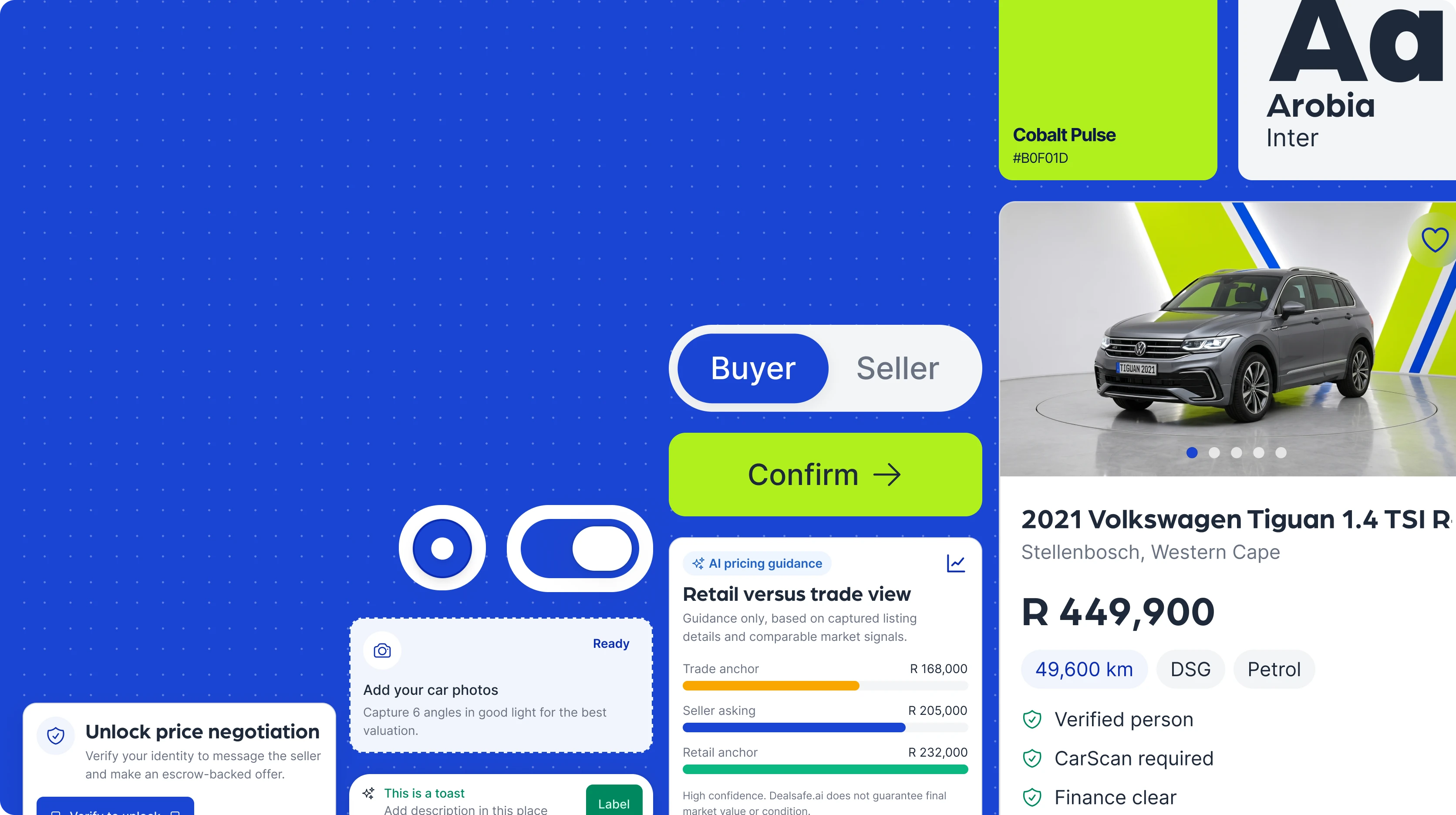
Cobalt anchors primary actions, lime brings the brand into focus, and violet provides a supporting accent. Each colour has a full tonal ramp so it can work across emphasis, surfaces and contrasting text.
Semantic roles select from those primitives. Feedback has its own success, warning, error and information colours, keeping a brand accent distinct from the state of a transaction.
Give information a clear hierarchy.
Arboria carries the display and heading voice, Inter supports body copy and interface labels, and DM Mono makes technical values easy to distinguish. A Major Third scale and fluid sizing connect the hierarchy across viewport sizes.
Make the small decisions repeatable.
Spacing tokens progress from compact internal gaps to generous section spacing. Radius tokens define a consistent set of corners for controls, cards and containers. Those foundations reduce the number of one-off decisions each new screen needs.
The spacing examples below show pixel equivalents at a 16px root size. Native components also define dimensions suited to touch interaction.
Separate the values from their meaning.
The token structure has three layers: primitive values, semantic roles and component aliases. A component asks for the role it needs; the theme decides which primitive supplies it.
For the web primary button, component.button.primary.background resolves to semantic.color.interactive.primary.default, which uses brand.primary.500 (#1A44D2) in both themes. This mapping comes from DealSafe’s token source.
Keep the purpose as the theme changes.
Light and dark mappings let a surface, text label or border retain its role while its value changes. Buttons, fields, segmented controls and status treatments can share a visual language without relying on a single fixed background.
Build a clear hierarchy of actions.
The web button library covers primary, secondary, outline, ghost, destructive and link variants. The default control is 32px high with a 12px corner radius; colour and emphasis distinguish the action’s role.
Make every input understandable.
Fields, selection controls and switches give forms a consistent structure. Labels establish what is needed, supporting text explains the decision, and validation makes the next correction visible.
Make state visible.
Feedback combines colour, an icon and a written label. Success, warning, error and information treatments carry through badges and messages so a person can understand what happened and what needs attention.
Compose components around the vehicle.
Vehicle imagery, price, supporting facts and a clear action come together as a repeatable card. The composition gives the smaller parts a purpose: helping someone scan and compare a vehicle before opening the detail view.
Document the component where it is designed.
The kit covers familiar controls and the patterns specific to DealSafe: vehicle cards, trust checklists, metric grids, pricing bands and deal timelines. Information frames explain composition, variants and properties alongside light and dark examples.
This gives each pattern a purpose in the product. A metric grid is not simply a collection of tiles; it is a repeatable way to make vehicle facts and trust information easy to scan.
Turn the documentation into a working reference.
I built a documentation site with foundation references and live component examples. Designers and developers can inspect the system in the environment where it will be used, from colour and typography through forms, navigation and feedback.
The web library builds on shadcn-style components. I brought those building blocks into the DealSafe language through shared tokens, component styling and product-specific patterns.
Design native controls for the hand.
The native button specification is 56px high, with a 16px radius and 24px icons. The icon sits beside the label with an 8px gap, while 24px horizontal padding gives the content room to breathe.
Native primary actions use cobalt; the native secondary treatment uses lime. These are platform-specific choices: the web library’s neutral secondary button has a different treatment and a more compact default size.
Give the app its everyday building blocks.
MetricGrid arranges vehicle facts in two columns. TrustChecklist pairs each item with a success check. FormField, HorizontalChips and ToggleRow cover common input, filtering and settings patterns.
The native card uses 16px corners and padding, with a fine border and consistent internal gaps. Together, these small decisions make composed screens feel like parts of the same app.
Turn a transaction into understandable steps.
WorkflowTimeline distinguishes completed, active and pending steps, with additional review and risk states available when the flow needs them. ActionRail pairs a next action with supporting detail and a status badge.
PricingBand compares trade, asking and retail anchors. It communicates guidance while leaving the seller in control of the final price. These patterns address the decisions specific to DealSafe, beyond a general-purpose UI kit.
Give native components their own proving ground.
The Expo showcase makes the native library tangible on a device. It brings component demonstrations, themes and composed product screens together so that spacing, touch interaction and state changes can be inspected in context.
The native library builds on HeroUI Native and consumes generated theme outputs. Web and native share the design intent while keeping implementations appropriate to their platforms.
See the pieces become an app screen.
The vehicle detail view brings media, pricing, finance status and navigation into one mobile experience. Seeing those parts together tests the hierarchy: the vehicle comes first, the key facts stay visible, and the app’s main destinations remain familiar. The iOS navigation uses a floating, fully rounded tab bar in both the standalone component and composed screen.
Use the product to test the system.
I built the working DealSafe Expo prototype alongside the system. That created a short feedback loop: product needs exposed missing patterns, and the library turned those decisions into reusable building blocks.
The repository keeps tokens and shared components separate from the consuming apps. Documentation, the native showcase and the product can evolve together without copying styles between projects.
Explore the work
A week of connected design and build.
Using Claude Code, Cursor and Codex, I completed the cross-platform system, product prototype, documentation and showcase in one week. I set the direction, shaped the components and reviewed the work across the design and implementation surfaces.
The result gave development a working foundation and significantly accelerated the workflow. The broader team reached a working MVP in three months.
Where it landed.
A functioning design system across Figma, web documentation and native code, with both a component showcase and a product prototype to demonstrate it. One week of solo system work helped support a three-month path to the team’s working MVP.
See the DealSafe product, brand & website