Capitec Design systems
Capitec Design System
A shared language for consistent banking experiences.
- Role
- Senior UX Designer
- Platforms
- Web and mobile
- Contribution
- Principles, components and QA
- Tools
- Sketch and Anima
The overview
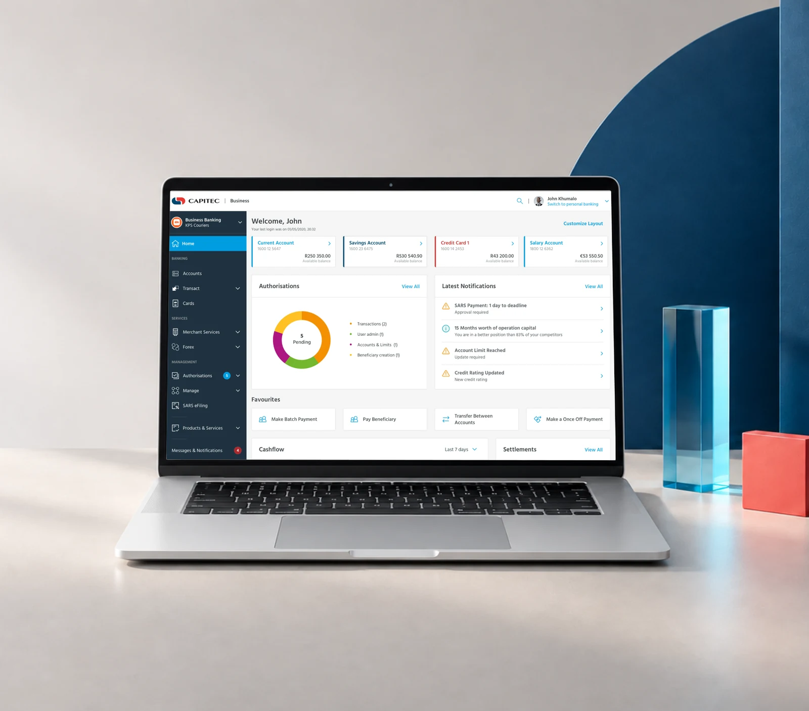
Capitec had components for its new mobile app, but they were not yet versatile enough for other platforms. The team also needed shared principles to guide consistent decisions across digital products.
The goal
Create a reusable design language for designers, developers and partner agencies.
My contribution
I facilitated workshops, designed and maintained components, prototyped patterns, and worked with the central front-end team on implementation and quality assurance.
Agree on what good looks like.
I facilitated workshops to define four principles aligned with Capitec’s values: Client First, Clarity, Consistency and Engagement. They gave teams a common way to evaluate decisions beyond visual styling.
Build a common foundation.
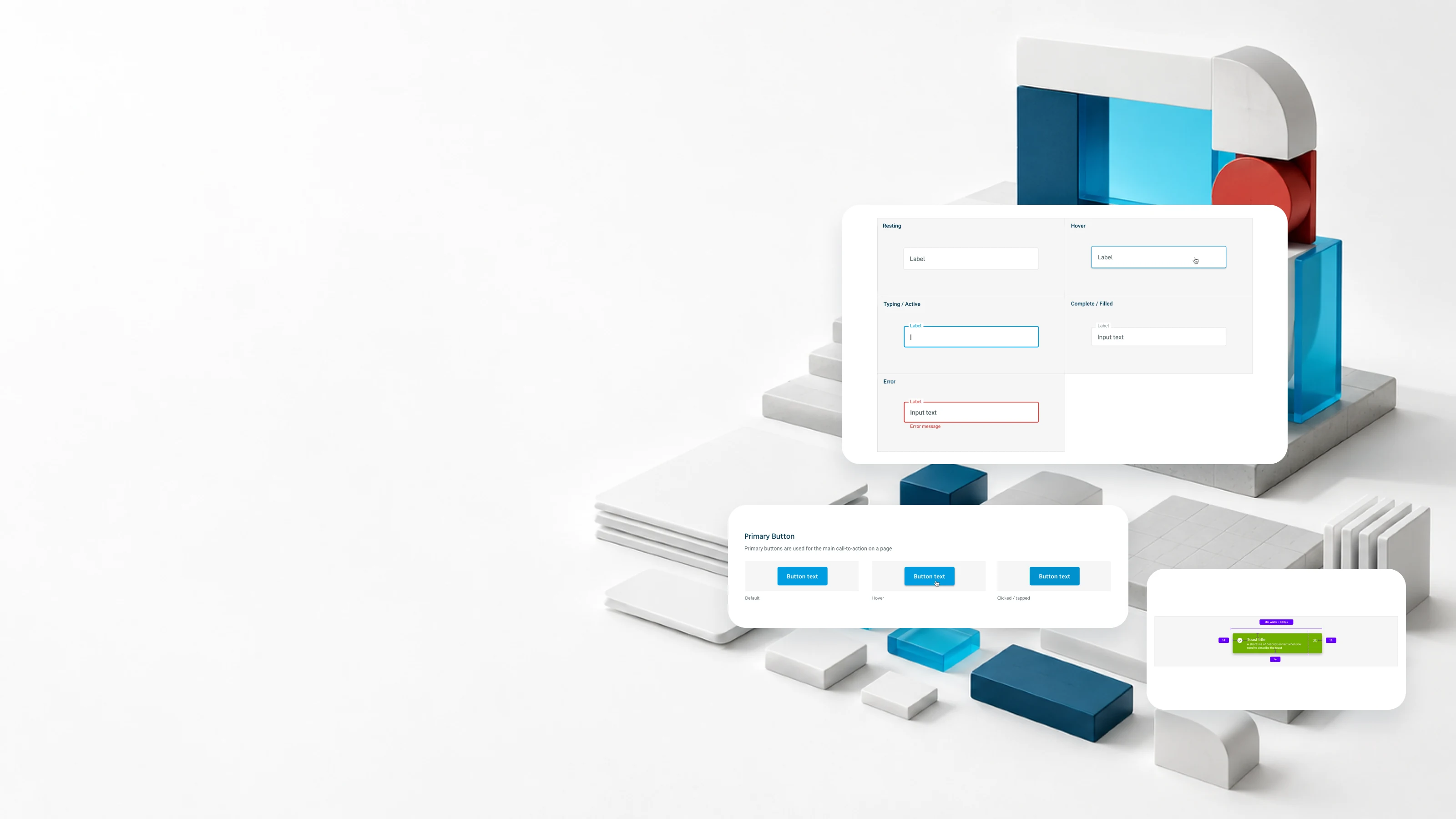
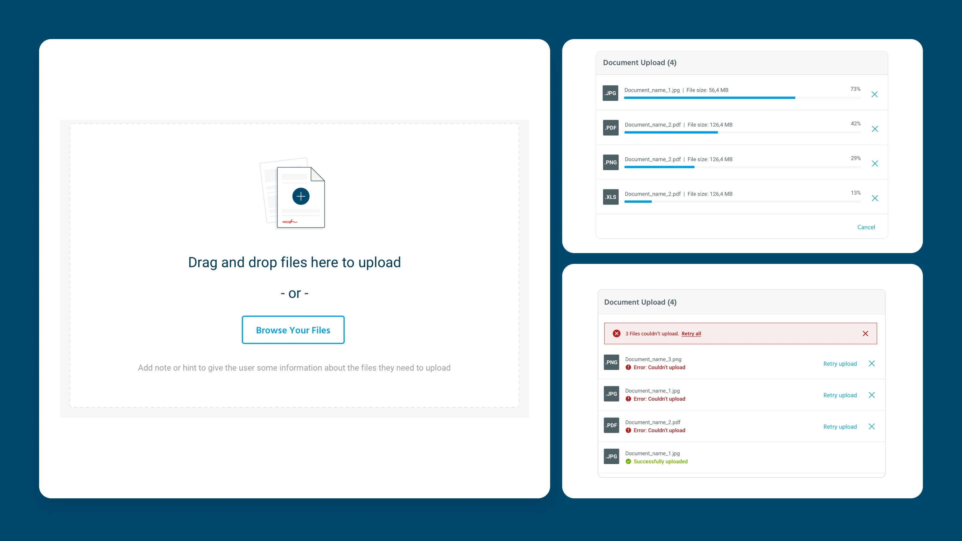
We used an atomic design approach, connecting colours, typography, icons and patterns into larger reusable parts. Components needed to adapt their behaviour across platforms while keeping the experience familiar.
Make consistency practical.
The library defined how colour communicates status and action, established a shared digital typeface, and provided custom icons and illustration guidance. Reusable patterns helped teams apply those decisions in real interfaces.
Keep design and development connected.
Sketch and Anima supported responsive components, while collaboration with the front-end team and ongoing design QA helped align the library with implementation. The aim was to let developers assemble interfaces from shared components without rebuilding their styles.
Where it landed.
The work created a shared foundation for web and mobile design. Dedicated documentation in Zeroheight and a move to Figma were proposed next steps; neither was completed during my time on the project.